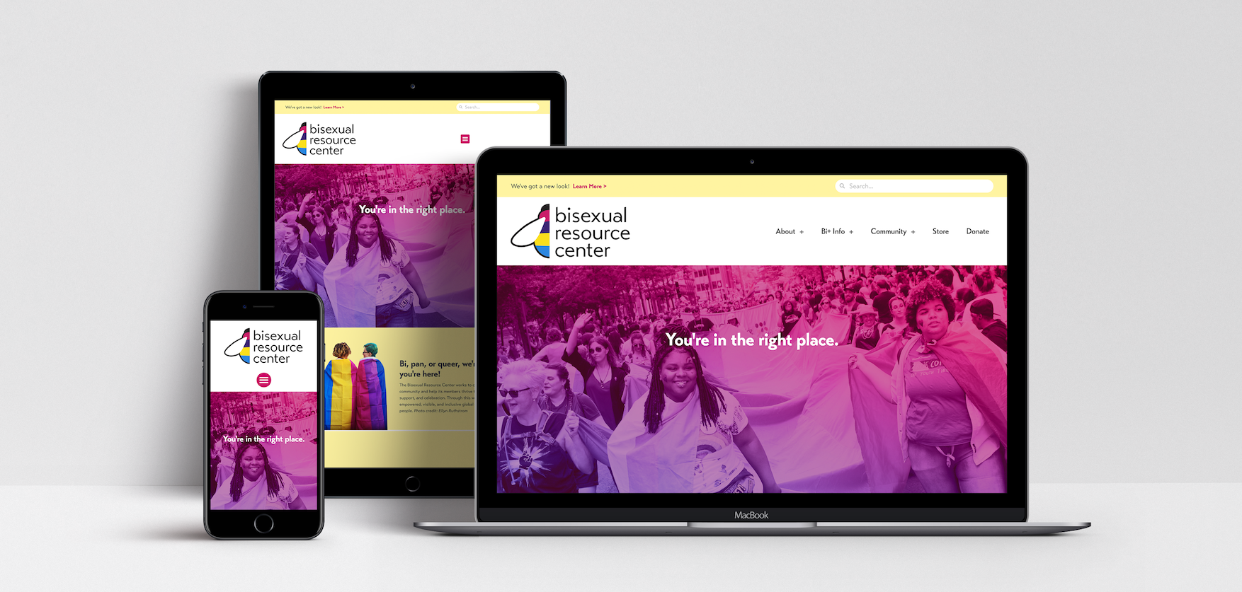
For the website redesign, images from pride events replaced illustrations to ensure visitors to the site saw more people like themselves, fulfilling a request from the 2018 community survey.
Challenge
Prompted by a 2018 community survey, the Bisexual Resource Center (BRC) was tasked with the challenge of rebranding their image to be more inclusive: not only to people of color, but also to people with disabilities and people who used different personal labels other than “bisexual.” The survey replies indicated that folks wanted to see more images of themselves, both in the materials presented and also in the messaging. The BRC also wanted to center more joy into their programming moving forward, and noted that as a goal with the new branding as well.
Solution
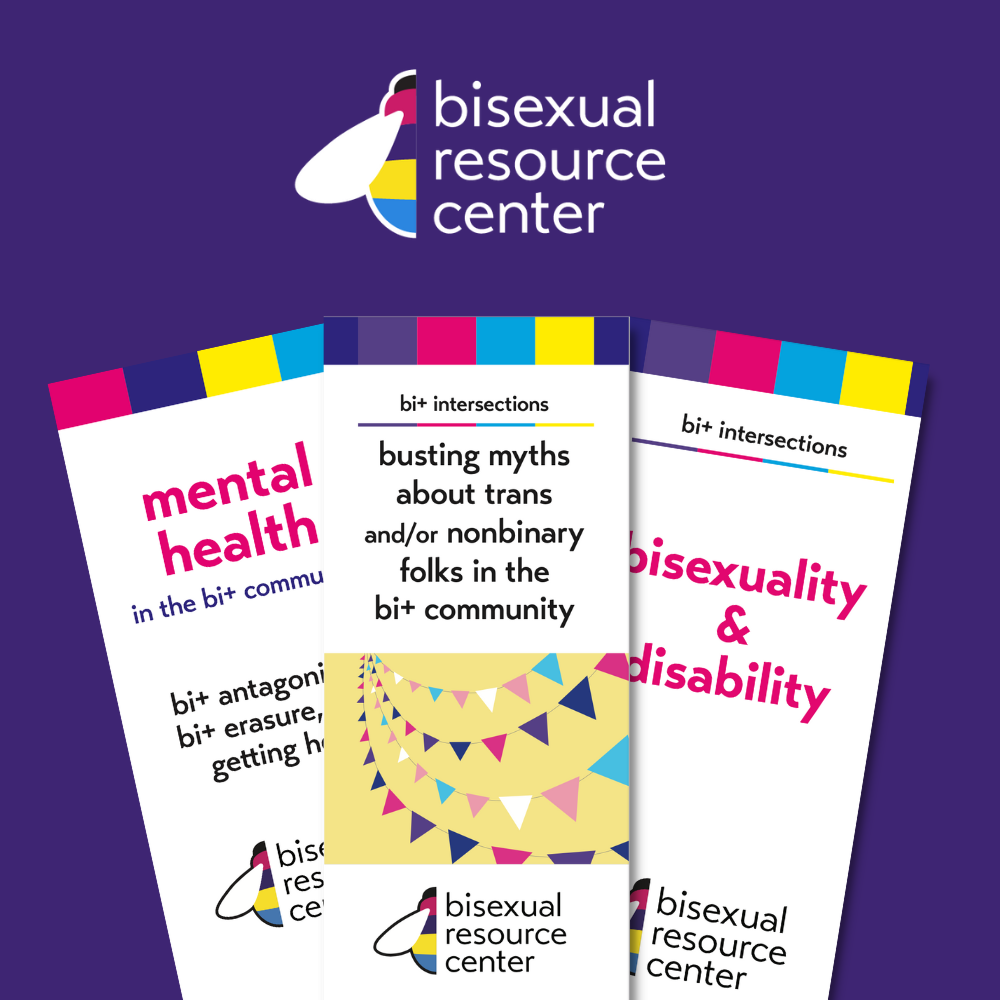
After meeting with the board of directors and reading the 2018 survey results, I developed several possible solutions, keeping in mind the legacy of the bee imagery, the pride colors of pink, purple, and blue, and the inclusion of the pansexual pride colors of teal and yellow. The logo chosen integrates colors from the bisexual and pansexual flags, as well as a more simplified bee form that can still be overlayed with the many different pride flags of the community overall.
Expanded resources reflect the new color scheme
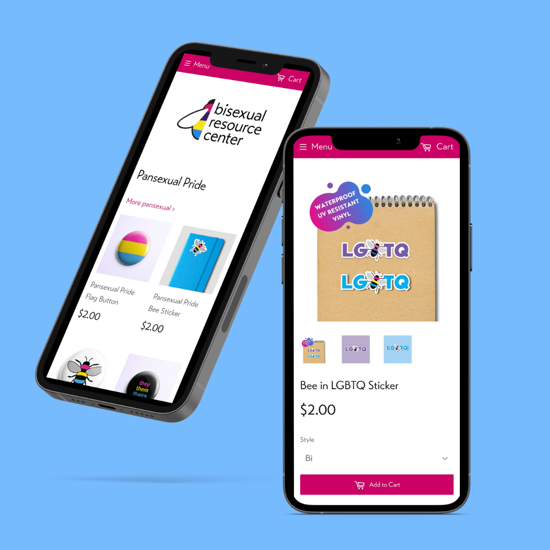
The old bee shape, still very popular as a merchandise item, is available in the shop in many different flags of the community.